Overview
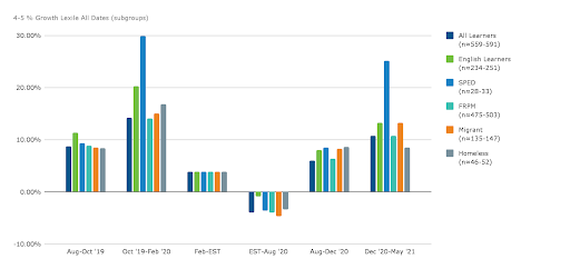
Spreadsheet applications such as Microsoft Excel and Google Sheets make it easy to generate visualizations of data. However, it is critical to ensure that you carefully choose appropriate graphs or charts to accurately represent your data. For example, showing growth over time works well with line charts, but a bar chart like the one below would be more appropriate for comparing a percentage of change.

NOTE: When building charts, make sure that you also pay attention to the x and y axis to ensure you can accurately make comparisons across the data. The x and y axis should be consistent to ensure graphs are not skewed and misleading. Typically, each axis should span from the minimum to the maximum value and be labeled accordingly so as not to unintentionally mislead a reader.